Introducing GoTo's Design Principle
Introducing GoTo's Design Principle
Dec 14, 2023
Dec 14, 2023
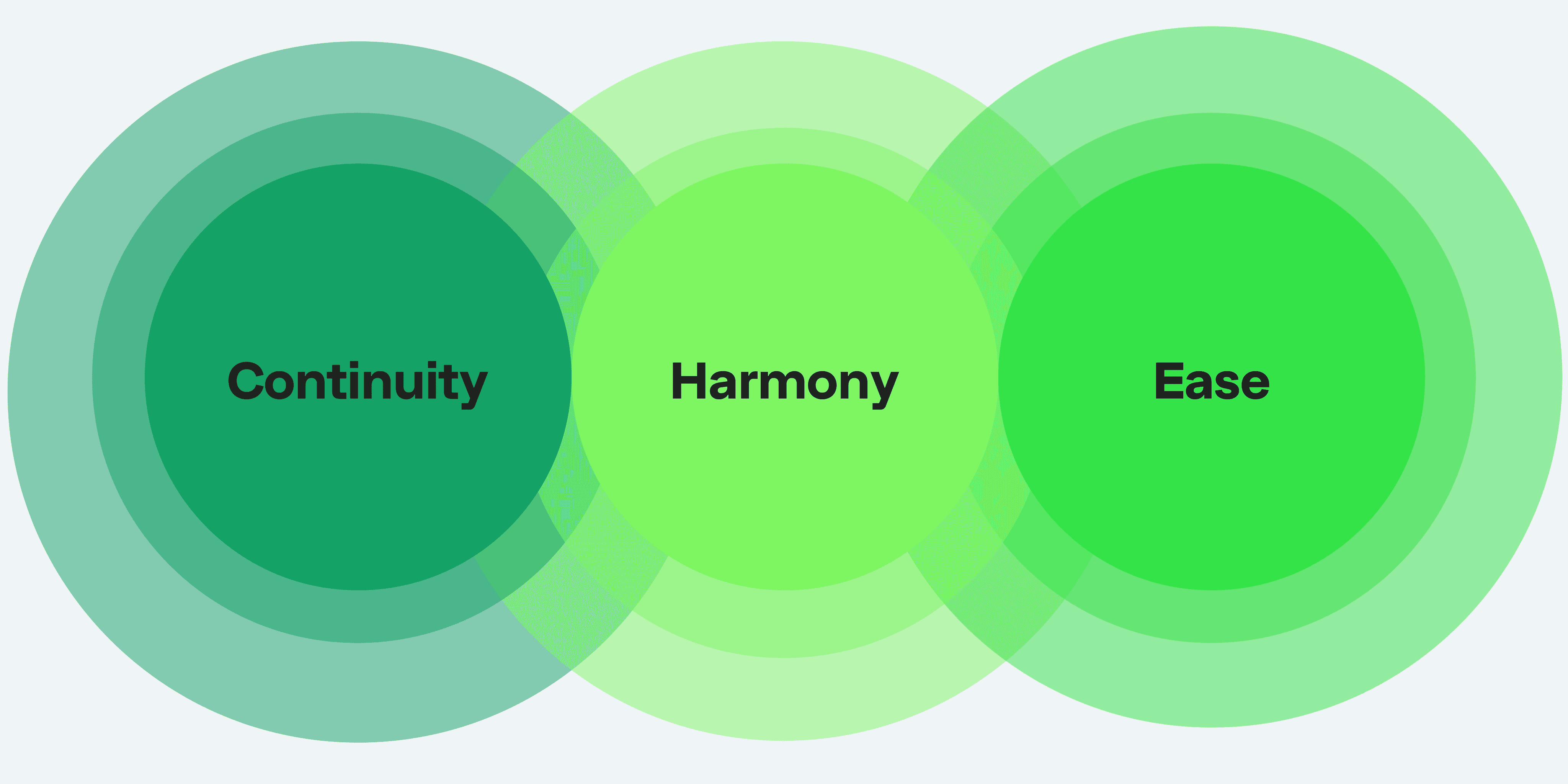

We have developed a new set of design principles for the GoTo experience and interface. These principles provide a framework for guiding the design of features and user interfaces across all GoTo apps and services. Here is our new set of GoTo design principles:
Continuity, Harmony, and Ease
Let’s take a closer look:
Continuity
It’s about how our design can have consistent, familiar, and connected design language across our features and apps.
Continuity in the GoTo feature refers to the consistent and connected experience across all GoTo apps. The visuals/UI should be similar, and the information presented should be well-structured, relevant, and informative, allowing for quick and efficient navigation. The design should be fresh and cohesive, with a holistic approach that caters to various needs, from transportation to shopping to payments.
Harmony
It’s about our design should be empathetic, relatable, and engaging, with actionable and concise messaging that is easy to understand.
The GoTo design should be empathetic towards users by understanding their needs and providing an engaging and relatable experience. The design should use concise messaging that is easy to understand, encouraging users to take action. The messaging should be actionable and unambiguous, empowering users to feel in control and safe. The design should be modern and motivate users to take action.
Ease
It's about how our users feel effortless when they interact intuitively with our design across our features and apps.
GoTo feature should be simple and easy to use, aims to ensure that users can navigate the platform seamlessly, without feeling overwhelmed or frustrated. It should be accessible to all users and clear across all platforms, while maintaining each platform's identity. By providing an intuitive and effortless experience, we hope to foster a sense of loyalty and attachment to the entire GoTo ecosystem.
—
Where we started
This year, our team came together to tackle a challenging question as we embarked on building the GoTo UI: "How can we design an experience for GoTo that incorporates the unique strengths of Gojek, GoPay, and Tokopedia?"
After thorough research, we identified a crucial opportunity: To streamline and bump up the quality the GoTo UI, we require clear and effective design principles. Why we need principles? We recognize that we cannot gauge whether teams are designing in "the GoTo way" without defining what that means—we require direction. We aim to ensure that designers speak the same language when discussing design goals and providing feedback or design critique. An updated set of principles can provide some alignment in these areas.
In early 2023, we build a new set of features and experiences between Gojek, Tokopedia, and Gopay. As our primary objective is to establish connective tissues among the products and services offered by the operating companies within the GoTo ecosystem. To accomplish this, we are focused on strengthening GoTo as a consumer-facing brand through the implementation of a Unified Passport Profile (GoTo Passport), Unified Loyalty program (GoTo Rewards), and Unified Subscription model (GoTo PLUS).
Crafting new design principles
In June 2023, our working group - consisting of about a dozen SCP stakeholders like from product managers, product designers, master brand, and UX writers - held a collaborative workshop to address a common issue. The goal was to gather contributions from everyone in the group, rather than relying on one person to dictate what GoTo design should look like.
We use three fundamental principles - Experience (Feel), Surface (Visual/Look), and Tone of Voice (Language) - as our framework for defining our design principles. We collect ideas and insights from participants and refine them into principles that help streamline and improve our design quality.
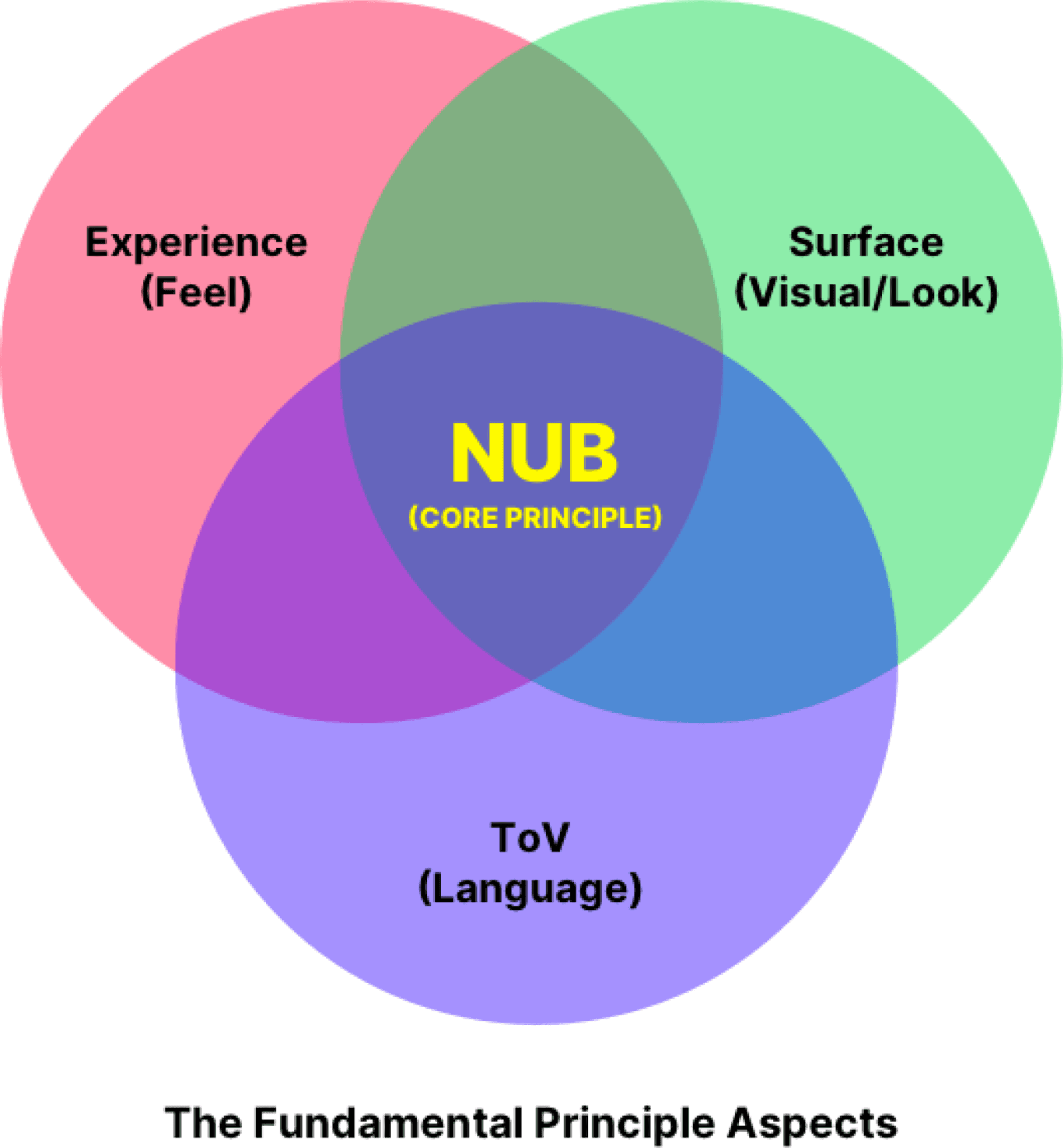
Session 1: Collecting & Grouping Ideas and Insights from Participants
During the first session of the workshop, we asked the participants to write down their ideas on sticky notes in Figjam for each fundamental principle - Experience (Feel), Surface (Visual/Look), and Tone of Voice (Language). We encouraged them to share as many ideas as possible, to generate a wide range of perspectives and insights. The goal was to gather contributions from everyone in the group, rather than relying on one person to dictate what GoTo design should look like.
Experience
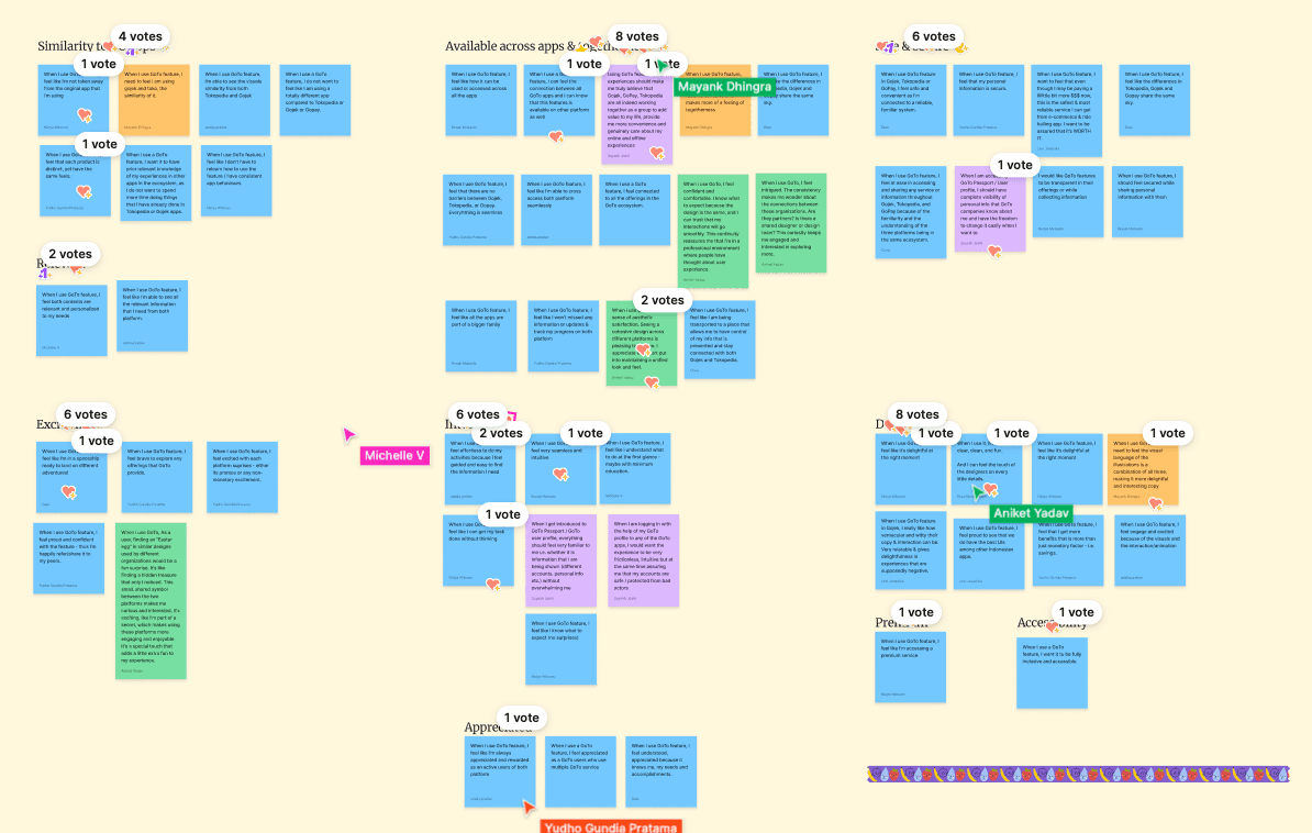
We obtained more than 50 ideas and divided them into several major categories according to the similarity of the ideas, including:
Similarity to BU apps (7 Ideas)
Relevant (1 Idea)
Excitement (5 Ideas)
Available Across Apps & Togetherness (14 Ideas)
Intuitive (7 Ideas)
Appreciated (3 Ideas)
Safe & Secure (8 Ideas)
Delightful (8 Ideas)
Premium (1 Idea)
Accessibility (1 Idea)
Surface
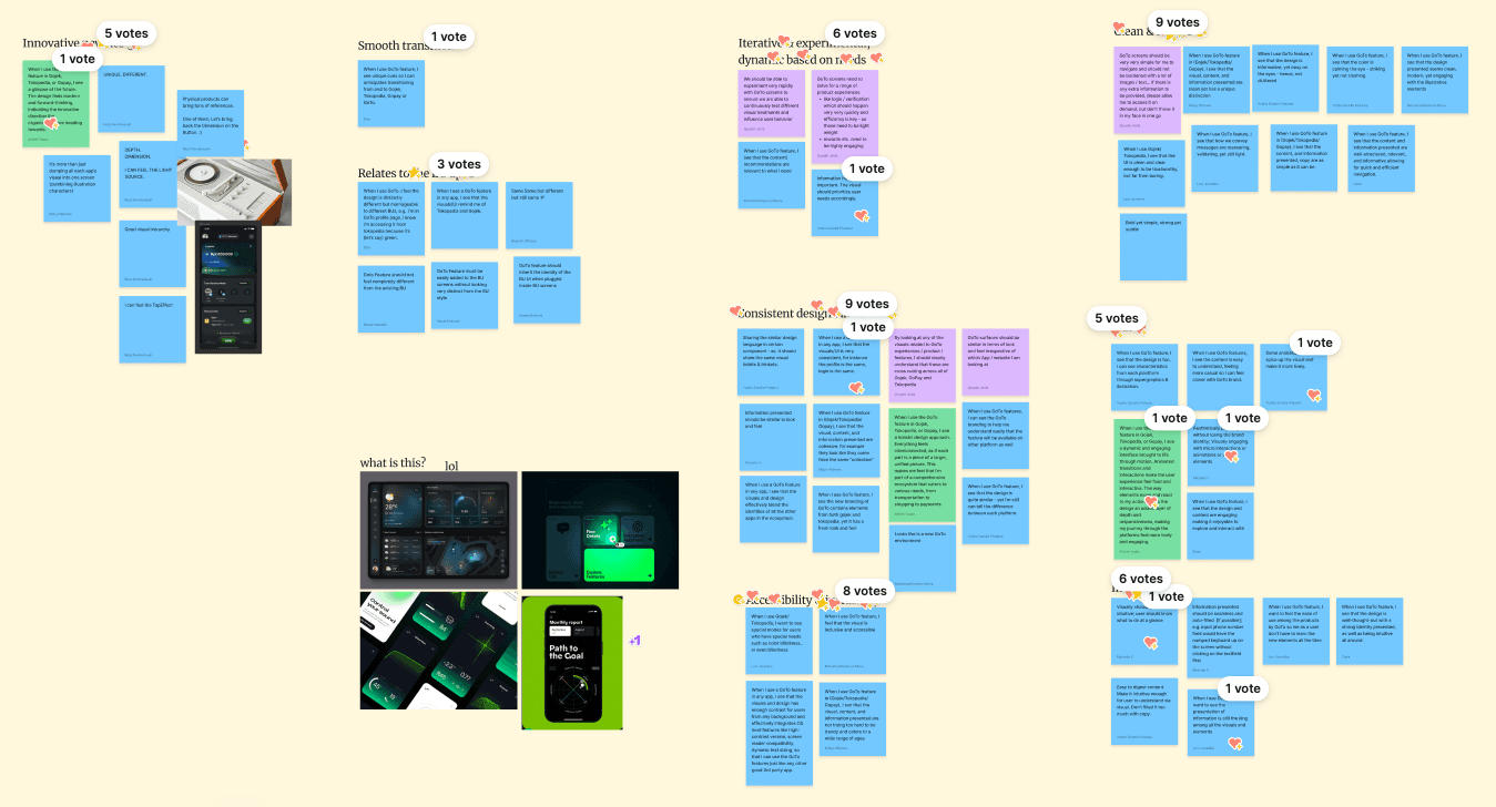
We obtained more than 50 ideas and divided them into several major categories according to the similarity of the ideas, including:
Innovative New Design (7 Ideas)
Smooth Transitions (I Idea)
Relates to the BU Apps (6 Ideas)
Iterative & Experimental, Dynamic based on needs (4 Ideas)
Consistent Design Language (12 Ideas)
Accessibility & Inclusivity (4 Ideas)
Clean & Simple (10 Ideas)
Fun (6 Ideas)
Intuitive (6 Ideas)
Tone of Voice
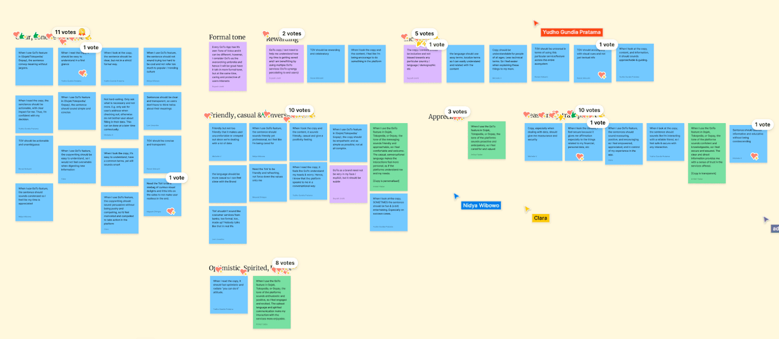
We obtained more than 40 ideas and divided them into several major categories according to the similarity of the ideas, including:
Clear, Concise & Simple (15 Ideas)
Formal Tone (1 Idea)
Rewarding (3 Ideas)
Friendly, Casual & Conversational (11 Ideas)
Optimistic, Spirited, Upbeat (2 Ideas)
Inclusive (6 Ideas)
Appreciated (1 Idea)
Reassuring and Transparent (6 Ideas)
Session 2: Voting and Selecting Grouping Based on the Most Suitable Principles for Our Products
During the second session of the workshop, we held an extensive discussion on the principles that would best guide our product development process. Through a rigorous voting process, we were able to select the most suitable principles that perfectly align with our vision for the product.
Experience
For the fundamental principle of Experience, we chose three key principles that would ensure that our product is not only user-friendly but also capable of providing a seamless experience across different apps. These principles are "Available Across Apps & Togetherness", "Delightful”, and “Intuitive.”
Surface
For Surface, we decided to go with the principles of "Consistent Design Language", "Clean & Simple," and “Fun.” which would ensure that our product has a sleek, modern look while being easy to navigate.
Tone of Voice
Finally, for Tone of Voice, we identified three principles that would be critical in ensuring that our product has a voice that is both clear and engaging to our target audience. These principles are “Reassuring and Transparent”, "Clear, Concise & Simple" and "Friendly, Casual & Conversational."
Session 3: Synthesizing and Defining Design Principles
During the third session of the workshop, the internal working group synthesized and defined the design principles for the GoTo experience. These principles were based on the contributions and insights gathered from the group and were divided into three fundamental principles: Experience (Feel), Surface (Visual/Look), and Tone of Voice (Language).
Experience
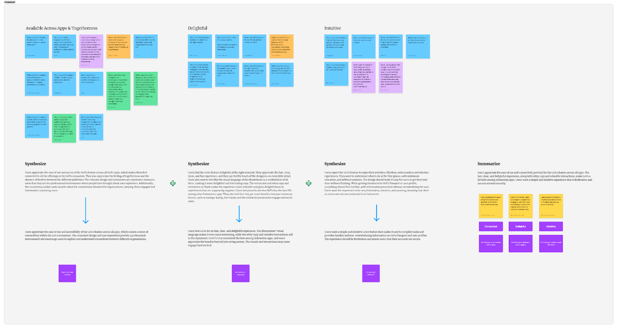
Available Across Apps & Togetherness
Users appreciate the ease of use and accessibility of the GoTo feature across all apps, which creates a sense of connectivity within the GoTo ecosystem. The consistent design and user experience provide a professional environment and encourage users to explore and understand connections between different organizations.
Keywords: Connected and Familiar
Delightful
Users love GoTo for its fast, clear, and delightful experience. The illustrations' visual language makes it even more interesting, while the witty copy and relatable interactions add to the enjoyment. GoTo's UI is considered the best among Indonesian apps, and users appreciate the benefits beyond just saving money. The visuals and interactions keep users engaged and excited.
Keywords: Relatable and Engaging
Intuitive
Users want a simple and intuitive GoTo feature that makes it easy to complete tasks and provides familiar and non-overwhelming information on GoTo Passport and user profiles. The experience should be frictionless and assure users that their accounts are secure.
Keywords: Intuitive and Effortless
Surface
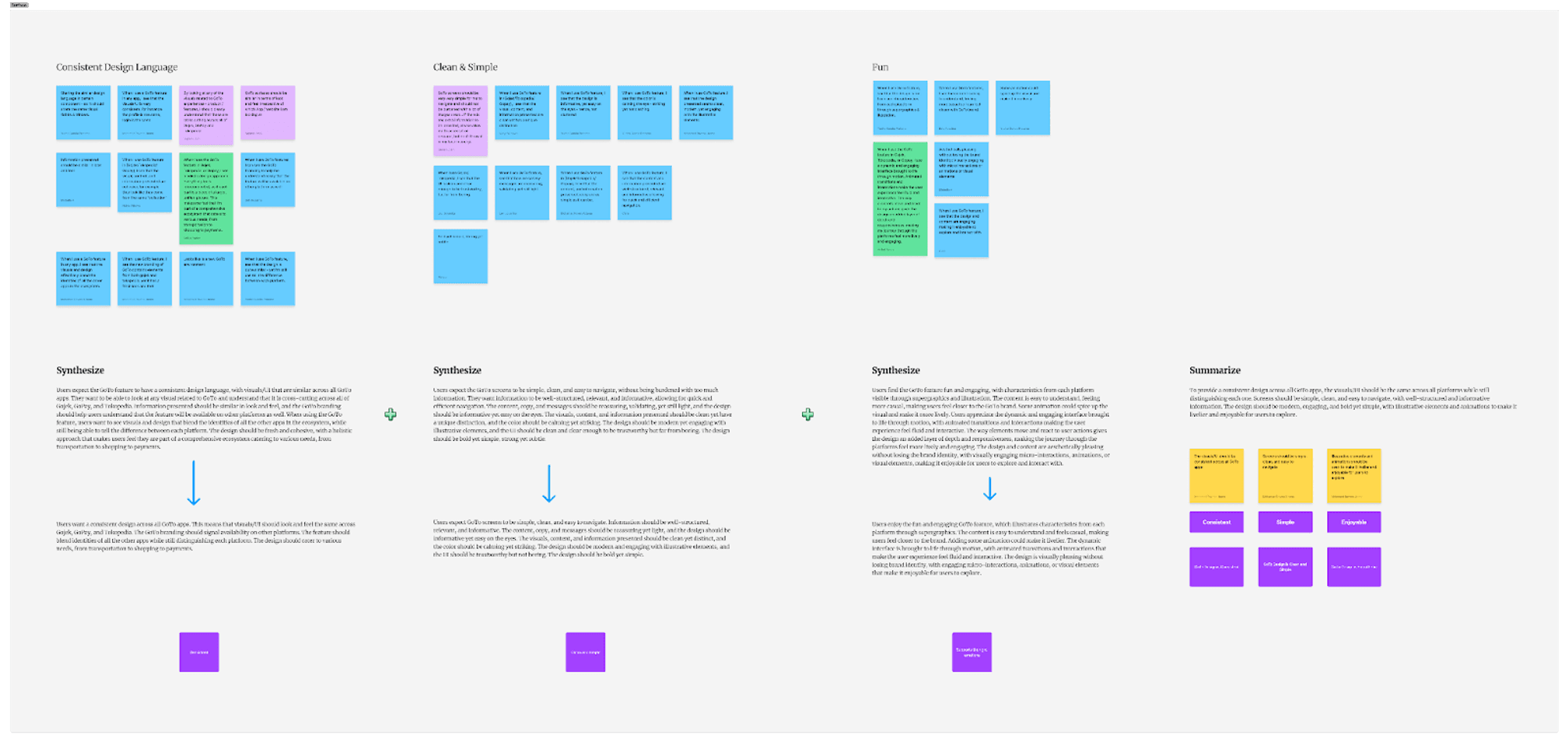
Consistent Design Language
Users want a consistent design across all GoTo apps. This means that visuals/UI should look and feel the same across Gojek, GoPay, and Tokopedia. The GoTo branding should signal availability on other platforms. The feature should blend identities of all the other apps while still distinguishing each platform. The design should cater to various needs, from transportation to shopping to payments.
Keyword: Consistent
Clean & Simple
Users expect GoTo screens to be simple, clean, and easy to navigate. Information should be well-structured, relevant, and informative. The content, copy, and messages should be reassuring yet light, and the design should be informative yet easy on the eyes. The visuals, content, and information presented should be clean yet distinct, and the color should be calming yet striking. The design should be modern and engaging with illustrative elements, and the UI should be trustworthy but not boring. The design should be bold yet simple.
Keywords: Clean and Simple
Fun
Users enjoy the fun and engaging GoTo feature, which illustrates characteristics from each platform through supergraphics. The content is easy to understand and feels casual, making users feel closer to the brand. Adding some animation could make it livelier. The dynamic interface is brought to life through motion, with animated transitions and interactions that make the user experience feel fluid and interactive.
Keyword: Supports the Right Emotions
Tone of Voice
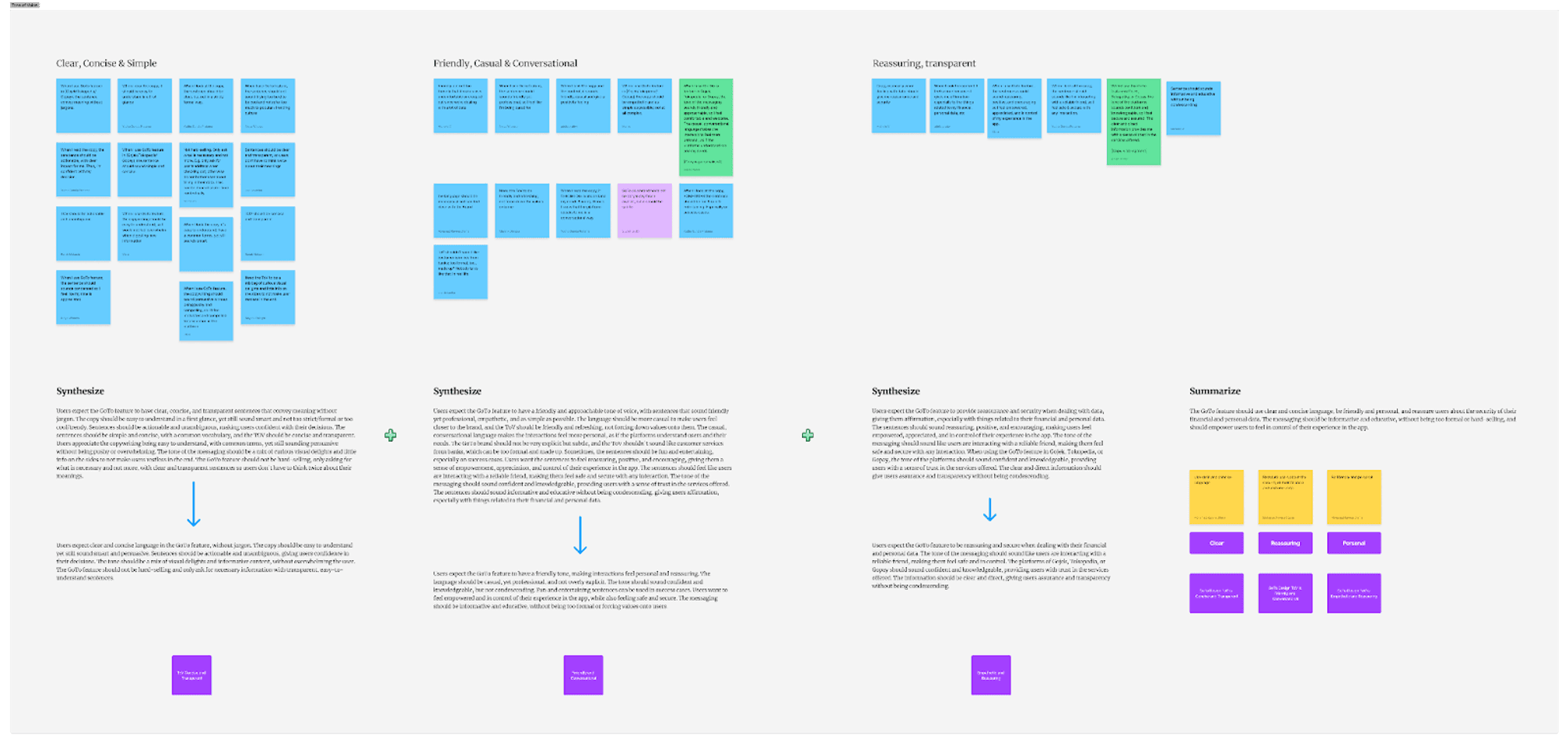
Clear, Concise & Simple
Users expect clear and concise language in the GoTo feature, without jargon. The copy should be easy to understand yet still sound smart and persuasive. Sentences should be actionable and unambiguous, giving users confidence in their decisions. The tone should be a mix of visual delights and informative content, without overwhelming the user. The GoTo feature should not be hard-selling and only ask for necessary information with transparent, easy-to-understand sentences.
Keywords: ToV Concise and Transparent
Friendly, Casual & Conversational
Users expect the GoTo feature to have a friendly tone, making interactions feel personal and reassuring. The language should be casual, yet professional, and not overly explicit. The tone should sound confident and knowledgeable, but not condescending. Fun and entertaining sentences can be used in success cases.
Keywords: Friendly and Conversational
Reassuring, transparent
Users expect the GoTo feature to be reassuring and secure when dealing with their financial and personal data. The tone of the messaging should sound like users are interacting with a reliable friend, making them feel safe and in control. The platforms of Gojek, Tokopedia, or Gopay should sound confident and knowledgeable, providing users with trust in the services offered. The information should be clear and direct, giving users assurance and transparency without being condescending.
Keywords: Empathetic and Reassuring
Combined into GoTo Design Principles
After some lively debate, we agreed that principles should serve as a framework to guide, create, and evaluate our work, especially when creating GoTo features and UI. Principles can help product designers make design decisions and provide a common language for design critiques. However, the real challenge was defining what the new principles should be. What values and design attributes should we aspire to when designing? What should the product feel like?
Based on this, we developed a draft of the new principles, shared it with our design leadership team, and made some fine-tuning adjustments.
And voilà! Our new set of GoTo design principles was born.
We have developed a new set of design principles for the GoTo experience and interface. These principles provide a framework for guiding the design of features and user interfaces across all GoTo apps and services. Here is our new set of GoTo design principles:
Continuity, Harmony, and Ease
Let’s take a closer look:
Continuity
It’s about how our design can have consistent, familiar, and connected design language across our features and apps.
Continuity in the GoTo feature refers to the consistent and connected experience across all GoTo apps. The visuals/UI should be similar, and the information presented should be well-structured, relevant, and informative, allowing for quick and efficient navigation. The design should be fresh and cohesive, with a holistic approach that caters to various needs, from transportation to shopping to payments.
Harmony
It’s about our design should be empathetic, relatable, and engaging, with actionable and concise messaging that is easy to understand.
The GoTo design should be empathetic towards users by understanding their needs and providing an engaging and relatable experience. The design should use concise messaging that is easy to understand, encouraging users to take action. The messaging should be actionable and unambiguous, empowering users to feel in control and safe. The design should be modern and motivate users to take action.
Ease
It's about how our users feel effortless when they interact intuitively with our design across our features and apps.
GoTo feature should be simple and easy to use, aims to ensure that users can navigate the platform seamlessly, without feeling overwhelmed or frustrated. It should be accessible to all users and clear across all platforms, while maintaining each platform's identity. By providing an intuitive and effortless experience, we hope to foster a sense of loyalty and attachment to the entire GoTo ecosystem.
—
Where we started
This year, our team came together to tackle a challenging question as we embarked on building the GoTo UI: "How can we design an experience for GoTo that incorporates the unique strengths of Gojek, GoPay, and Tokopedia?"
After thorough research, we identified a crucial opportunity: To streamline and bump up the quality the GoTo UI, we require clear and effective design principles. Why we need principles? We recognize that we cannot gauge whether teams are designing in "the GoTo way" without defining what that means—we require direction. We aim to ensure that designers speak the same language when discussing design goals and providing feedback or design critique. An updated set of principles can provide some alignment in these areas.
In early 2023, we build a new set of features and experiences between Gojek, Tokopedia, and Gopay. As our primary objective is to establish connective tissues among the products and services offered by the operating companies within the GoTo ecosystem. To accomplish this, we are focused on strengthening GoTo as a consumer-facing brand through the implementation of a Unified Passport Profile (GoTo Passport), Unified Loyalty program (GoTo Rewards), and Unified Subscription model (GoTo PLUS).
Crafting new design principles
In June 2023, our working group - consisting of about a dozen SCP stakeholders like from product managers, product designers, master brand, and UX writers - held a collaborative workshop to address a common issue. The goal was to gather contributions from everyone in the group, rather than relying on one person to dictate what GoTo design should look like.
We use three fundamental principles - Experience (Feel), Surface (Visual/Look), and Tone of Voice (Language) - as our framework for defining our design principles. We collect ideas and insights from participants and refine them into principles that help streamline and improve our design quality.

Session 1: Collecting & Grouping Ideas and Insights from Participants
During the first session of the workshop, we asked the participants to write down their ideas on sticky notes in Figjam for each fundamental principle - Experience (Feel), Surface (Visual/Look), and Tone of Voice (Language). We encouraged them to share as many ideas as possible, to generate a wide range of perspectives and insights. The goal was to gather contributions from everyone in the group, rather than relying on one person to dictate what GoTo design should look like.
Experience

We obtained more than 50 ideas and divided them into several major categories according to the similarity of the ideas, including:
Similarity to BU apps (7 Ideas)
Relevant (1 Idea)
Excitement (5 Ideas)
Available Across Apps & Togetherness (14 Ideas)
Intuitive (7 Ideas)
Appreciated (3 Ideas)
Safe & Secure (8 Ideas)
Delightful (8 Ideas)
Premium (1 Idea)
Accessibility (1 Idea)
Surface

We obtained more than 50 ideas and divided them into several major categories according to the similarity of the ideas, including:
Innovative New Design (7 Ideas)
Smooth Transitions (I Idea)
Relates to the BU Apps (6 Ideas)
Iterative & Experimental, Dynamic based on needs (4 Ideas)
Consistent Design Language (12 Ideas)
Accessibility & Inclusivity (4 Ideas)
Clean & Simple (10 Ideas)
Fun (6 Ideas)
Intuitive (6 Ideas)
Tone of Voice

We obtained more than 40 ideas and divided them into several major categories according to the similarity of the ideas, including:
Clear, Concise & Simple (15 Ideas)
Formal Tone (1 Idea)
Rewarding (3 Ideas)
Friendly, Casual & Conversational (11 Ideas)
Optimistic, Spirited, Upbeat (2 Ideas)
Inclusive (6 Ideas)
Appreciated (1 Idea)
Reassuring and Transparent (6 Ideas)
Session 2: Voting and Selecting Grouping Based on the Most Suitable Principles for Our Products
During the second session of the workshop, we held an extensive discussion on the principles that would best guide our product development process. Through a rigorous voting process, we were able to select the most suitable principles that perfectly align with our vision for the product.
Experience
For the fundamental principle of Experience, we chose three key principles that would ensure that our product is not only user-friendly but also capable of providing a seamless experience across different apps. These principles are "Available Across Apps & Togetherness", "Delightful”, and “Intuitive.”
Surface
For Surface, we decided to go with the principles of "Consistent Design Language", "Clean & Simple," and “Fun.” which would ensure that our product has a sleek, modern look while being easy to navigate.
Tone of Voice
Finally, for Tone of Voice, we identified three principles that would be critical in ensuring that our product has a voice that is both clear and engaging to our target audience. These principles are “Reassuring and Transparent”, "Clear, Concise & Simple" and "Friendly, Casual & Conversational."
Session 3: Synthesizing and Defining Design Principles
During the third session of the workshop, the internal working group synthesized and defined the design principles for the GoTo experience. These principles were based on the contributions and insights gathered from the group and were divided into three fundamental principles: Experience (Feel), Surface (Visual/Look), and Tone of Voice (Language).
Experience

Available Across Apps & Togetherness
Users appreciate the ease of use and accessibility of the GoTo feature across all apps, which creates a sense of connectivity within the GoTo ecosystem. The consistent design and user experience provide a professional environment and encourage users to explore and understand connections between different organizations.
Keywords: Connected and Familiar
Delightful
Users love GoTo for its fast, clear, and delightful experience. The illustrations' visual language makes it even more interesting, while the witty copy and relatable interactions add to the enjoyment. GoTo's UI is considered the best among Indonesian apps, and users appreciate the benefits beyond just saving money. The visuals and interactions keep users engaged and excited.
Keywords: Relatable and Engaging
Intuitive
Users want a simple and intuitive GoTo feature that makes it easy to complete tasks and provides familiar and non-overwhelming information on GoTo Passport and user profiles. The experience should be frictionless and assure users that their accounts are secure.
Keywords: Intuitive and Effortless
Surface

Consistent Design Language
Users want a consistent design across all GoTo apps. This means that visuals/UI should look and feel the same across Gojek, GoPay, and Tokopedia. The GoTo branding should signal availability on other platforms. The feature should blend identities of all the other apps while still distinguishing each platform. The design should cater to various needs, from transportation to shopping to payments.
Keyword: Consistent
Clean & Simple
Users expect GoTo screens to be simple, clean, and easy to navigate. Information should be well-structured, relevant, and informative. The content, copy, and messages should be reassuring yet light, and the design should be informative yet easy on the eyes. The visuals, content, and information presented should be clean yet distinct, and the color should be calming yet striking. The design should be modern and engaging with illustrative elements, and the UI should be trustworthy but not boring. The design should be bold yet simple.
Keywords: Clean and Simple
Fun
Users enjoy the fun and engaging GoTo feature, which illustrates characteristics from each platform through supergraphics. The content is easy to understand and feels casual, making users feel closer to the brand. Adding some animation could make it livelier. The dynamic interface is brought to life through motion, with animated transitions and interactions that make the user experience feel fluid and interactive.
Keyword: Supports the Right Emotions
Tone of Voice

Clear, Concise & Simple
Users expect clear and concise language in the GoTo feature, without jargon. The copy should be easy to understand yet still sound smart and persuasive. Sentences should be actionable and unambiguous, giving users confidence in their decisions. The tone should be a mix of visual delights and informative content, without overwhelming the user. The GoTo feature should not be hard-selling and only ask for necessary information with transparent, easy-to-understand sentences.
Keywords: ToV Concise and Transparent
Friendly, Casual & Conversational
Users expect the GoTo feature to have a friendly tone, making interactions feel personal and reassuring. The language should be casual, yet professional, and not overly explicit. The tone should sound confident and knowledgeable, but not condescending. Fun and entertaining sentences can be used in success cases.
Keywords: Friendly and Conversational
Reassuring, transparent
Users expect the GoTo feature to be reassuring and secure when dealing with their financial and personal data. The tone of the messaging should sound like users are interacting with a reliable friend, making them feel safe and in control. The platforms of Gojek, Tokopedia, or Gopay should sound confident and knowledgeable, providing users with trust in the services offered. The information should be clear and direct, giving users assurance and transparency without being condescending.
Keywords: Empathetic and Reassuring
Combined into GoTo Design Principles
After some lively debate, we agreed that principles should serve as a framework to guide, create, and evaluate our work, especially when creating GoTo features and UI. Principles can help product designers make design decisions and provide a common language for design critiques. However, the real challenge was defining what the new principles should be. What values and design attributes should we aspire to when designing? What should the product feel like?
Based on this, we developed a draft of the new principles, shared it with our design leadership team, and made some fine-tuning adjustments.
And voilà! Our new set of GoTo design principles was born.
Copyright © 2024 Raven. Ngantuk guys 😴.
Copyright © 2024 Raven. Ngantuk guys 😴.